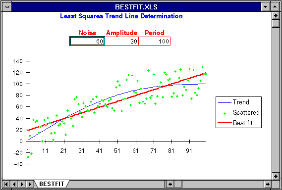
Another Excel worksheet, BESTFIT.XLS, allows you to see how a straight-line trend is fitted to randomly varying measurements of an underlying trend, and the extent to which the trend line estimated this way reflects the actual trend.
Load the worksheet and resize the window is necessary so your screen looks like this:

The actual trend in this model is a straight line that runs from zero to 100 over 100 days. You can introduce random noise into the measurements from which the trend is calculated by setting Noise to the width of the noise band. If Noise is 10, measurements are randomly displaced ± 5 from the actual trend.
You can also add a sinusoidal variation to the basic straight line trend, anything ranging from a small amplitude, high frequency, wiggle to a large secular change that ties the trend line into a knot. Amplitude controls the extent of the deviation from a straight line; the trend will range from -Amplitude to +Amplitude around the basic straight trend line. Period controls how rapidly the trend line wiggles from its central value in terms of days between crest and trough.
The fundamental rising trend, modified by the sinusoidal variation specified by Amplitude and Period, is shown as a blue line. The raw data points that result from displacing values on that curve based on the setting of Noise are plotted as green diamonds. The straight line trend that best fits the noisy data points shown by the green dots is plotted as a thick red line. To the extent this line is representative of the actual trend in blue, the trend fitting procedure can be trusted. Note, as you experiment with this worksheet, how long period, high amplitude variation in the basic trend, equivalent to reversals in an established trend of weight loss or gain, can spoof the trend line calculation and yield misleading trend estimates.
By John Walker