« March 25, 2006 |
Main
| March 29, 2006 »
Monday, March 27, 2006
The Visual Display of Quantitative. . .Whatever
Have you seen the
Autodesk Annual Report for Fiscal Year 2005? (Note that due to Autodesk's January fiscal year, a
small business practice that Dan Drake and I are responsible for, this is the year-old document which covers the fiscal year ending in January 2005; I have not yet received the 2006 annual report, but it should come to hand soon.) I have long been one of those sceptical green-eyeshade people who reads annual reports, prospectuses, and proxy documents from back to front, and I hadn't happened to glance at the “front of book” material in this document until today when I'd pulled it out to look up a number for a calculation I was doing and, before putting it back on the shelf, happened to idly flip through the colour material at the start.
One of the oldest tricks in the satchel of the PR flack is the “area chart”,
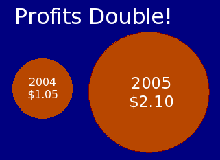
like this made-up one.

What's wrong with this picture? Well, look at what they're doing to your brain, hoping you won't notice. Profits did, indeed, double between 2004 when the company made a
buck 'o five and 2005 when it cleared a big two-ten. This has been reflected by doubling the
diameter of the circle representing the 2005 profit compared to that for 2004. But doesn't it
look a lot bigger than twice the size? Of course: brains which evolved in an epoch where it was
very important to be able to distinguish between a tiger and a tabby cat tend to perceive the size of something from its area, not linear measure, and the circle at right has four times the area and four times as many pixels filling it as the one for 2004. I've kind of given away the game by including the numbers within the circles; an even more slippery presentation would omit them.
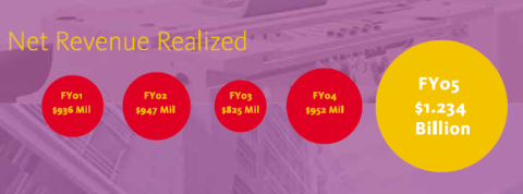
Once you've become attuned to this kind of creative graphical presentation, you develop a background process which rings a little bell in your brain when something doesn't look quite right, and that's the little tinkle I heard when flipping past page 3 of the annual report, from which I have extracted the following chart and reduced it in scale to fit on this page; click the image for the full page captured from the on-line PDF edition of the document.

Tinkle, tinkle,
tinkle! Let's take a closer look at this graphic, shall we? I grabbed the image from a 55% scale PDF display of the page and measured the diameter of the circles in pixels with
The Gimp (measurement of a raster image is not as precise a taking dimensions off a CAD drawing, but a difference of a pixel of two doesn't make any substantial difference here). The results, tabulated and crunched with an
OpenOffice
Calc
spreadsheet are as follows.
| Year | Revenue | Diameter |
Area | Diam/RevB | Area/RevM |
| 2001 | 936 | 82 |
5281 | 87.6 | 5.6 |
| 2002 | 947 | 89 |
6221 | 94.0 | 6.6 |
| 2003 | 825 | 70 |
3848 | 84.8 | 4.7 |
| 2004 | 952 | 100 |
7854 | 105.0 | 8.2 |
| 2005 | 1234 | 173 |
23506 | 140.2 | 19.0 |
The column labelled
Diam/RevB is the result of dividing the diameter of the circle in pixels by the revenue in billions, while
Area/RevM is the area of the circle in pixels divided by the revenue in millions. If the diameters of the circles were proportional to the revenue (as in the “Profits Double!” chart at the top), all the numbers in the
Diam/RevB column should be the same, since the ratio of the diameter of the circles to the revenue they represent will be constant. If, on the other hand, the
area of the circles represents the revenue (and hence the diameters are proportional to the square root of the revenue), then the values in the
Area/RevM column should be the same, since the number of pixels which represent a unit of revenue should be equal for all years.
Taking a look at the actual results, we immediately arrive at a conclusion of “
Huh?” Neither the diameter nor the area are vaguely proportional to the revenue figures they're supposed to represent! The down year of 2003 is substantially smaller than it should be by either measure compared to the two preceding years, and the two most recent years are inflated, 2005 almost ridiculously so, compared to the scale of the preceding years. Revenue grew about 30% from 2004 to 2005, but the circle for 2005 has
three times as many pixels in it and, even if you go by diameter, has grown by more than 70% from 2004, which is itself at a substantially larger scale than the circles to its left.
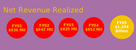
The chart below, which I made with
Impress, shows the revenue figures for 2001–2005 as circles with area proportional to the revenue figure. (If you must use figures with area for scalar values, as opposed to a line or bar chart, making the area proportional to the values you're graphing seems to me to the only reasonable choice.)

Gives a rather different impression, doesn't it? This is why I prefer to read those dull tables of numbers at the back of the document!
If you're interested in the use and abuse of graphics in the communication of quantitative data, you should treat yourself to
Edward Tufte's books, but you probably already knew that.
Posted at
03:37

