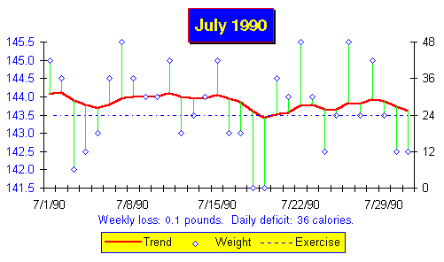
Here's my own chart for July of 1990, generated automatically by Excel. If I'd plotted the chart by hand, it might not look as crisp, but the message would be no less clear.

The chart is presented in the ``Floats and sinkers'' form described in
chapter ![]() (see page
(see page
![]() ). The heavy line is the weight trend;
individual daily weights are plotted as diamonds with lighter lines
tying them to the trend for that day. The exercise rung is plotted as
a light dashed line with missing days blank (or the whole line absent
if you've opted not to exercise). The weight scale, in pounds, is at
the left while the right hand scale reads exercise rungs. At the
bottom of the chart, a trend analysis appears.
). The heavy line is the weight trend;
individual daily weights are plotted as diamonds with lighter lines
tying them to the trend for that day. The exercise rung is plotted as
a light dashed line with missing days blank (or the whole line absent
if you've opted not to exercise). The weight scale, in pounds, is at
the left while the right hand scale reads exercise rungs. At the
bottom of the chart, a trend analysis appears.
This chart is easy to interpret. The analysis, as well as the trend line, indicates my weight was, for all intents and purposes, constant in July. The very slight downtrend of a tenth of a pound per week indicates I ate about 36 fewer calories per day than I burned, a shortfall I could remedy, if it bothered me, by eating the equivalent of one more pat of butter or slice of bacon per day.