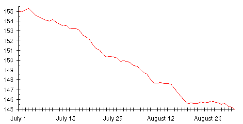
Armed with this new and potent tool, the moving average, let's reexamine Dexter's vexatious diet. This is how Dexter would have seen his weight loss if he'd plotted the exponentially smoothed moving average with smoothing constant 0.9 instead of daily weight. (This chart assumes Dexter had been recording his weight for a couple of weeks before he began the diet. If he hadn't, the first few days would look a little different but the rest of the graph would be identical.)
What a different view this is from the soul shredder called a ``daily
weight chart'' on page ![]() !
!
The right way to think about a trend chart is to keep it simple. The trend line can do one of three things:
That's it. The moving average guarantees the trend line you plot will obviously behave in one of these ways; the short term fluctuations are averaged out and have little impact on the trend.
The first thing to observe from the graph is what strikes you at first glance: it goes down! Further, after the first week, as the diet begins to take hold, it goes down relentlessly until Dexter declares the diet a success at the end of August. To be precise, in the 51 days of Dexter's diet, here's the breakdown of day to day changes in the trend.
| What happened? | How many days? |
|---|---|
| Went up | 4 |
| Went down | 37 |
| Stayed the same | 10 |
Despite all the weight swings that so disturbed Dexter there were only four days when the trend line rose. The next thing to notice is how accurately the trend line approximates a straight line during the middle of the diet. Dexter had cut his food intake consistently and expected a steady weight loss. That's what happened, but the loss was hard to discern on the scale. The trend line makes it immediately apparent.
By John Walker